
Project
(A)
Overview
(B)
Problem
Outcome
Info
(C)
Role
Timeline
Team
Tools
Design Sprint
(D)
Week: 1 - 2
Week: 3 - 4
Week: 5 - 6
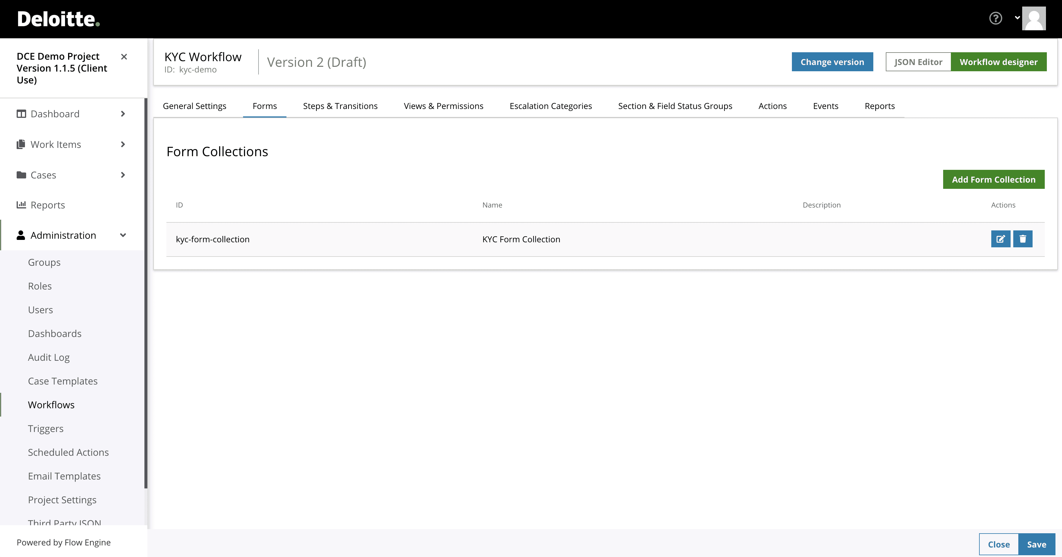
Previous layout
(E)


UX Research
(F)
Using semi-structured interviews and task analysis with System Administrators, I identified their pain points, goals, and needs. I then grouped insights using affinity mapping to prepare for ideation.
of Practitioners expressed concerned how complex the form configurations was.
of System Administrator think that relationship between sections were a hard to keep track on.
of System Administrator used two separate windows to visualise the final form layout.
Sketching
(G)


(H)
The Form builder workflow was designed to be an intuitive interface.
This interface makes it easy for users to add sections and understand and navigate through the form sections, reducing confusion and errors and ultimately improving the user-friendliness and efficiency of the design.

Feature #2
(I)
Adding and editing a form section would require the user to navigate different screens, making it complex and challenging to check some parameters.
By consolidating input fields into a single side panel, the complexity is reduced, allowing users to add information and set parameters more efficiently.
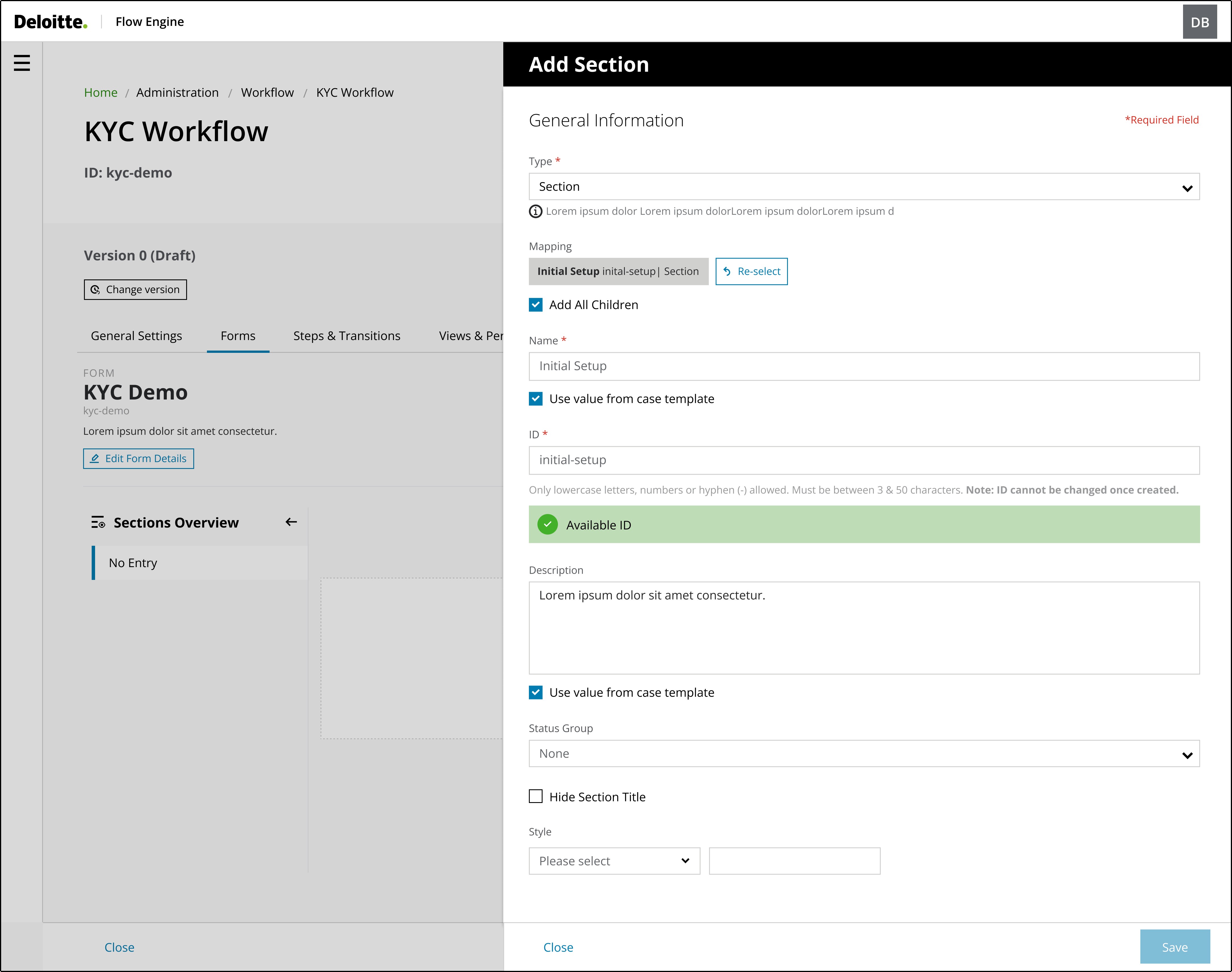
(J)
Feature #2
(K)
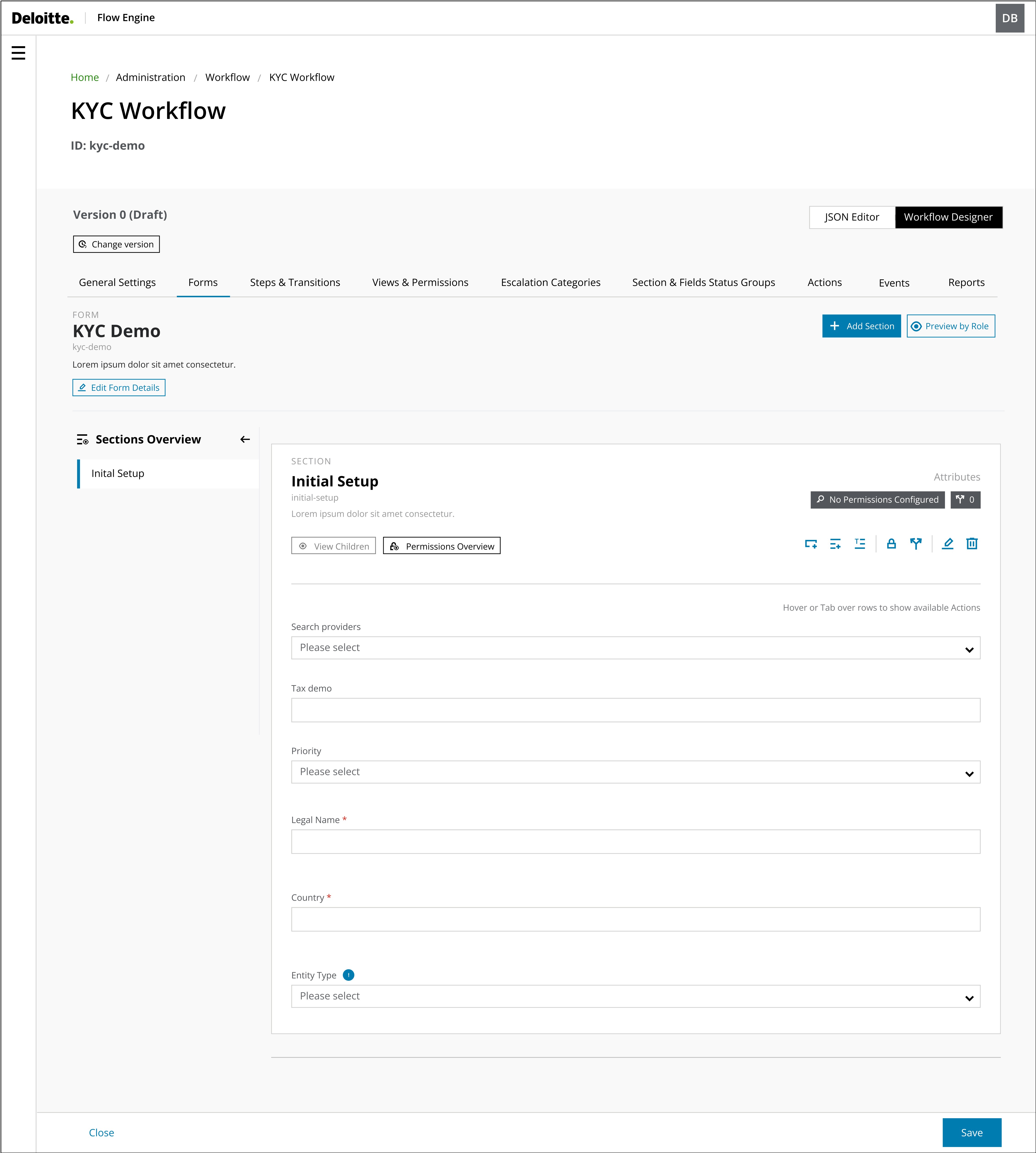
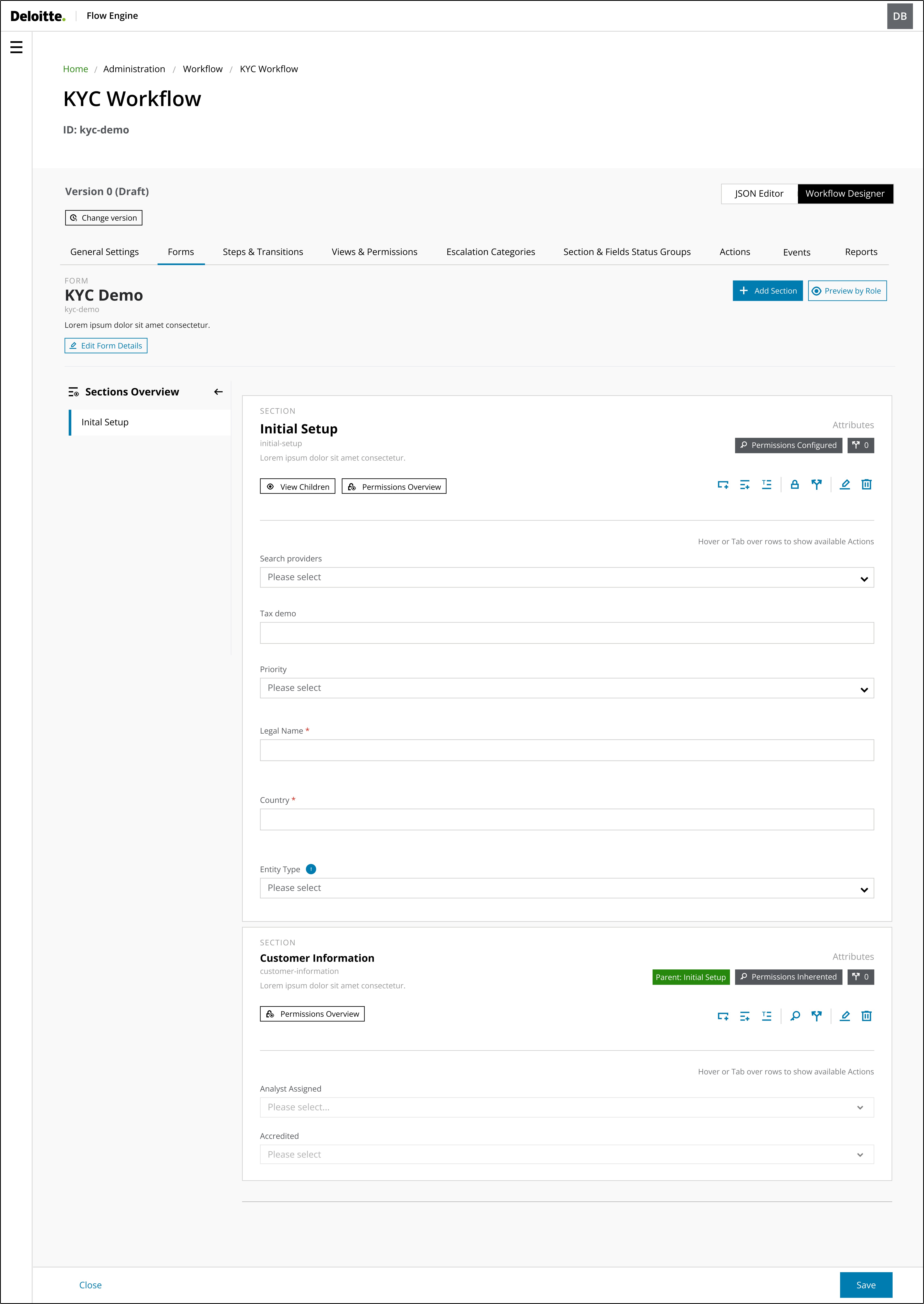
After users have added a parent section, they may need to add additional child sections or fields within that parent section.
The main goal of this interface was to provide users with a simple and easy method to add children's sections or fields while ensuring that they understand their relationships. The interface must be logical and intuitive, aligning with how users naturally structure information.
By implementing a design that mirrors users' real-life understanding of parent-child relationships, the aim was to establish a more user-friendly and efficient system. This approach significantly reduces cognitive load and enhances the overall user experience, as the system's structure aligns with users' expectations.
Insights
The stakeholders received the new interface and found it to flow well. They found that the form-creation process was simplified and more intuitive, and they completed the task in a shorter period, which indicated improved task efficiency.
Lessons Learnt
Participatory Design
User Mental Models
Complex Features